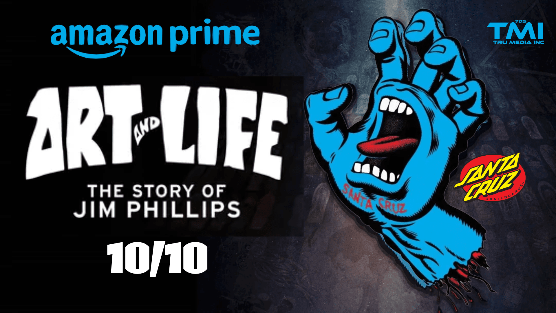
Art and Life: The Story of Jim Phillips spends a lot of its runtime on the years that defined him: his run as art director for NHS / Santa Cruz Skateboards.
Phillips started doing freelance work for the company in the mid-1970s and became art director around 1975.
That period is when Santa Cruz’s look was locked in.
He designed the slanted “Santa Cruz” lettering (the closed-triangle A’s) and, with co-owner Jay Shuirman, put it inside the red circle that became the Red Dot logo in 1978.
That mark is still the company’s primary identity and one of the most recognized images to come out of Santa Cruz County.
In 1985 he created the Screaming Hand for the Santa Cruz Speed Wheels line.
The idea came from old high-school doodles of a drowning hand sticking out of a wave; he clenched his own left hand, added a screaming mouth in the palm, and the graphic took off.
It quickly moved from wheels onto decks, stickers, and shirts and became one of skateboarding’s most copied images.
Beyond the two logos, Phillips produced thousands of pieces for NHS: full-bleed deck graphics, ads, catalogs, stickers, and wheel art.
He helped push skate graphics from a small center logo to wrapping the entire board. Standout Santa Cruz / rider models from his peak years include the
Rob Roskopp Face and
Monster series,
Jeff Grosso’s Alice in Wonderland and related boards,
Jason Jessee’s Neptune and Sun God, later
Natas Kaupas panther graphics,
Jeff Kendall’s Atomic Man / End of the World,
Keith Meek Slasher, and many others.
The style mixed thick line work, bright color, psychedelic cartoon energy, horror, and humor.
Originals from that era now sell as collectibles; Santa Cruz has reissued a lot of the art.
He also co-designed the Independent Trucks Maltese Cross logo (again with Shuirman) in the same period.
After leaving full-time in the early 1990s he later returned under license; NHS still uses his archive and new Phillips-family work.
His son Jimbo Phillips grew up in that studio and continued the Santa Cruz graphic tradition.
The documentary uses that NHS era as the spine of the story: the volume of work, the pressure of being the in-house artist during skateboarding’s boom years, the later studio closure, and the eventual renewed collaboration.
Festival screenings and the 2025
theatrical/streaming release (Apple TV, Amazon, YouTube, etc.) have mostly been framed around those two logos and the golden-era decks. Official site: